Be the first to write a review
Using Images in WordPress
How to upload images as well as how to size them so they fit in your theme
If you want to streamline your images for your WordPress (WP) blog, Linda shows how to do this in this tutorial. You'll learn how to upload images as well as how to size them so they fit in your theme.
Uploading Images into WP without FTP
If you do not plan to FTP your files to your blog, you're in luck. You can upload images easily into your WP blog without FTP, especially now that your settings are ready to accept those uploads. First, a quick look at the buttons you'll use for these uploads:
In the image above, I've created a new post ("Posts > Add New"). Note that the permalink for this particular post will show under the title for that post (it's blurred out here to protect the Web site I'm working with at the moment). Under that Permalink, which is the name of the post once you publish it, is a row of "Quicklinks" to help you upload/insert Media files.
For now, I want to concentrate on that first link, which allows users to upload images. The following three links include film or video, music and all media in general, respectively from left to right. While you can use the last Quicklink to the right to add all media, I suggest getting Pavlovian with this effort...use the Image icon for images, the film icon for film, etc. This way, you know that you have created a pattern of organization that will be easy to recreate if necessary. Additionally, your "Library" will reflect these efforts (more about this in a moment...).
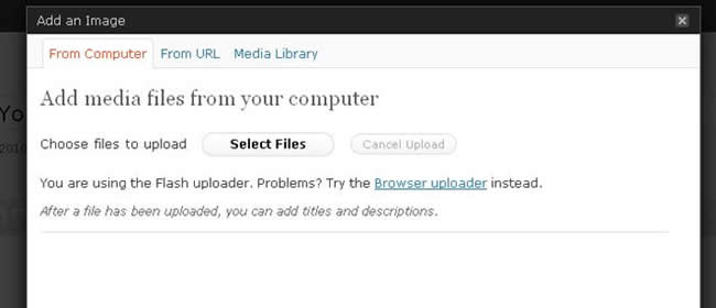
To insert an image into your post, simply click the image icon. You'll see this window pop up on your browser window:
You can see from the image above that you have a choice of uploading images via a Flash uploader (which often irritates the crap out of me) or through the Browser uploader. You probably know by my previous comment that I use the Browser uploader. This choice is faster, in my opinion, and easier to use.
When I click on the Browser uploader, I can upload any image from my computer hard drive:
Note the arrow above that points to "From Computer." This is the option I've chosen to add an image currently. If I wanted to add an image from another URL, I would chose that option. If I wanted to pick an image from my Media Library, I would chose that option. Since all three options offer different issues and perks, I'll cover all three choices...but for the moment, let's stay with the computer-based option.
After I pick an image from my hard drive, I click on the "upload" option. Be very careful about this choice, as if you pick the wrong image, that wrong image may show up on your blog, rather than the image you really want. You can rectify that mistake, if it occurs, and I'll show you how in just a second. First, pick the "right" image from your hard drive and you'll see this information appear:
I've added two arrows above to show that 1) when I add an image to a blog, I'm also adding an image to the Gallery. In this blog, no images have been added previously, so this is the first image to go into that "Gallery." It also will be the first image to go into my "Library," as you'll see shortly.
Secondly, the name of the file – as pointed out by that second arrow – is "deathtaxes." What I want to do here is change the name of that file for Search Engine Optimization (SEO) reasons, and to help me keep track of that image by a more recognizable name.
So, I will do the following...all mainly for SEO reasons, but also for accessibility and usability:
1.I will change the name of that file to read, "Death and Taxes."
2.I will change add that same "Death and Taxes" to the blank area for "Alternate Text" (which means that what you put in this area is the "alt" text for your image...something you absolutely need for SEO and for validation of pages for correct syntax. Do not avoid putting something into that slot.
3.I may or may not add that same "Death and Taxes" to the "Caption" slot. When I ignore that space is when the image contains text that can be read by someone who allows images on their browser. If, for instance, the image of the skull and money also contained text that read, "Death and Taxes," I may avoid adding a caption. Since it does not contain text, I will add a caption.
4.I also add a description of the image. This slot is for SEO, but it also is for folks who use screen readers, such as blind people. I will not add "Death and Taxes" to that slot, however, as I want to be more descriptive. Instead, I add, "Skull holding money in teeth, representing death and taxes."
5.I may keep the link URL that allows users to find a larger version of that image, or I may not. Not all images need to be linked to other sources. In some cases, I may want to link that image to another file at another Web site. For example, I may want to link that "Death and Taxes" image to a Wikipedia article or some other source. In that case, I would click on the "none" link to clear that space and then add my own link. In this case, I choose not to use a link.
6.Next, I want to align the image in my text box for my post. I choose whether I want to situate it to the right, left or centre or leave the image unaligned.
7.Finally, I want to choose the size of the image I uploaded. In this case, my image is not 'squared off,' meaning I did not create a square image for the thumbnail. So, if I choose a thumbnail – or if my blog theme uses thumbnails for any reason, that rectangular image may become distorted as it is converted into a square image. In this case, I'll take my chances.
Here's how it all looks once I'm made those changes:
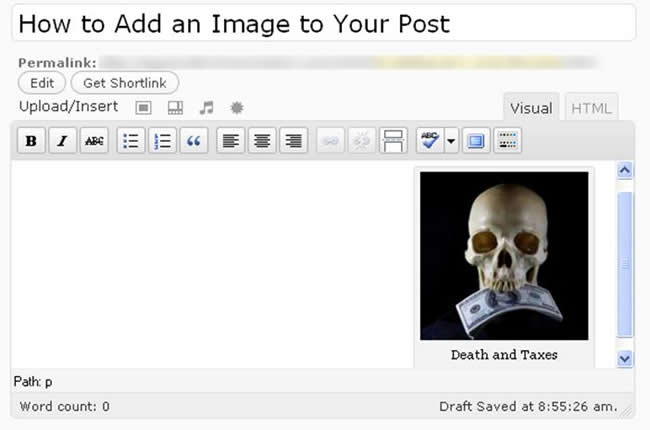
When I'm through, the image shows in the visual window like so:
Note the caption that says, "Death and Taxes." If I had not chosen to use a caption, that portion of the image would not have shown. If you click on the HTML tab above the text window, you'd see this:
The HTML code shown above shows everything you need to know about your uploaded file, including the size, the image number, the title you used as well as the caption. The description does not show, but when you publish that blog entry, it will show in the final code. Notice in the previous image that the distortion from converting a rectangular image to a square image is not all that noticeable. In some images, however, you may experience severe distortion.
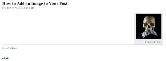
In many cases, I crop photos and images to make them square before I upload them so I don't need to deal with possible distortion. Although this cropping and re-sizing takes a bit of time, I have complete control over how those images look. And, for my peace of mind, this extra action is worth it to me. If I want to see how this image will look once published, I click on the "Preview" button to the top right on my dashboard, and I see this image (you may want to right-click and open in a new window or tab, depending upon your browser settings, so you don't open the preview in the same window where you are working on the blog post. While the "Preview often opens in a new tab for me, I often forget that this is how I have my browser settings fixed in Firefox):
There is no text in the post above, but if I added text, the image would remain in a "float:right" position with the "align:right" command that WP adds to the HTML.
Linda Goin
 Linda Goin carries an A.A. in graphic design, a B.F.A. in visual communications with a minor in business and marketing and an M.A. in American History with a minor in the Reformation. While the latter degree doesn't seem to fit with the first two educational experiences, Linda used her 25-year design expertise on archaeological digs and in the study of material culture. Now she uses her education and experiences in social media experiments.
Accolades for her work include fifteen first-place Colorado Press Association awards, numerous fine art and graphic design awards, and interviews about content development with The Wall St. Journal, Chicago Tribune, Psychology Today, and L.A. Times.


