Explore the Premium Content

Web-to-Print, Part II of II

Is Web-to-Print Profitable?

Part II of II

In the previous article, Linda explained Web-to-Print as a template-based prepress process that often uses POD, or Print On Demand, and digital presses. She provided some examples on how a Web designer or developer could add a sideline business as graphic designer or print broker in that article. But, what if you’re serious about adding a print business to your already thriving Web business? In this article, Linda explores more Web-to-Print solutions in-depth to illustrate what to look for and, alternately, what to avoid when you seek a profitable solution to a Web-to-Print business expansion.

Read More

Building Components with ActionScript 2.0 – part 1

Building Components with ActionScript 2.0 – part 1

This is the first in a series of tutorials about building components with ActionScript 2.0. In the first article, I’ll introduce you to the theory behind creating components and demonstrate a very simple example. Instead of building something from the ground up, we’ll learn about what you need in order to create a component. In the next article, we’ll create a component from scratch and I’ll walk you through the process in a little more detail so you have a chance to get your hands dirty.

In this tutorial, I’ll explain:

  • What makes up a component
  • How to create parameters for your component
  • Structuring your component’s movie clip
  • Creating an SWC file
  • Creating an extension from your component

Before you can complete the tutorial, you’ll need to have a good understanding of creating class files in ActionScript 2.0. I’ve used Flash 8 for the sample files so you’ll need this version if you want to explore to completed example.

You can download the files referred to in this tutorial from the blue Properties box that contains the article PDF. There's a heading titled Code Download and you can click the Details link next to it to get the zip file.

Note: If you have difficulties downloading the source files or PDF, you might have a problem with your cookies. Delete the cookies from your machine and try again. In Internet Explorer, you can do this by choosing Tools > Internet Options… and clicking the Delete Cookies… button on the General tab.

Read More

ASP.NET “Mini” Master/Detail Pattern

ASP.NET “Mini” Master/Detail Pattern

In ASP.NET 2.0 the master/detail pattern has undergone massive improvements, however when working with ASP.NET 1.1 and Visual Studio .NET 2003/2002 it is a much more manual process. There are hundreds of articles regarding this subject however the most common usage is with large amounts of data; meaning long lists, with subsets of data that can fill large forms.

Sometimes the amount of data is smaller and you need to develop a much more compact version of this pattern, providing your users with a quick and easy lookup for extra information regarding your entity, whatever it may be.

In this tutorial we’ll look at a compact or “mini” version of the master/detail pattern which uses a very small list of data presented in a DataGrid component, and selecting a row in the DataGrid will display a minimal amount of extra information on another details form contained in the same page.

In addition to the master/detail pattern we’ll also implement a few tips & tricks with the DataGrid component to give us a more usable control. Below is a list of other aspects covered in this tutorial:

  • Bound column concatenation: Binding more than one column in the data source to a
    single column on the DataGrid component without using code-behind
  • Primary Key lookup: Binding the primary key to a hidden field on the DataGrid for easy seeking of rows on selection
  • Select anywhere feature: Allowing the user to click on any cell on the DataGrid to invoke the SelectedIndexChanged event
  • Manual DataSet object construction: How to create a DataSet through code including a primary key column
  • Enable smart navigation to minimize page refresh visually

Although this tutorial is designed to be used in a more compact fashion the pattern itself can easily be migrated to larger implementations with larger volumes of data. This tutorial is not based on the new ASP.NET 2.0 implementation wizards for building master/detail pages; it is designed for ASP.NET 1.1.

Note: Visual Studio .NET running ASP.NET 1.1 is required for this tutorial. Both VB.NET and C# code samples will be provided

Read More
FREE

Free, Pure ASP Upload 3 - Upload Multiple Files at Once

Today we'll show you how to you can enable your users to upload multiple files at once with Pure ASP Upload and the Flash Based Upload Control. [view]

Get Pure Upload 3 read more


Read More

Web-to-Print, Part I of II

Is Web-to-Print Profitable?

Part I of II

Within the past six years the Web-to-Print business has blossomed, and Web designers or developers might look to these services to supplement income. But since the business has expanded so rapidly, how does the designer choose and use any given online Web-to-Print service? The process varies, depending on if you want to expand your business to include printing presses, or if you want to become a print broker (a liaison between a customer and a full-service print house), a desktop publisher, or a designer for Web-to-Print services. In this first part of a two-part article, Linda explains the processes behind Web-to-Print and examines several options that can expand your business.

Read More

Building a Rich Text Editor. Part V

Introduction

This article is Part V of the series on building online Rich Text Editor.

In Part I, Part II, Part III and Part IV we have built most of the application features. In this iteration we will cover file manipulation functionality: creating, printing, saving files locally (to the user’s hard drive) as well as sending the document as an email message or an attachment. 

Read More

Export Calendar Items to Outlook 2K3

Export Calendar Items to Outlook 2K3

One of the advantages to working with Microsoft development platforms is that there are often convenient integration tools available to leverage the functionality of other advanced Microsoft applications. The Microsoft Office suite of products is a widely known and used bundle of software that can give you access to advanced features without doing a ton of extra coding.

One of the products in this suite is Outlook 2003. Known of course as mainly an email reader it also has a myriad of features and support for tasks, calendars, notes, contacts, meetings and more. When developing your own applications it is sometimes advantageous to take advantage of these features instead of trying to develop them yourself.

Note: This tutorial requires Visual Studio .NET running ASP.NET 1.1, however, the code provided can be implemented and translated into any language. The web form is simply an interface to exporting the vCalendar. Both VB.NET and C# code samples will be provided

Tech Note: This tutorial was tested with Outlook version 2003. The vCalendar may have different implementations within previous versions of Outlook and may require additional tweaking not provided by this tutorial. The assumption will be that you are running Outlook 2003

Read More

Design and Accessibility: Part XVII

Multimedia: More Usable than Ever

In the previous article, Linda explained how to develop trust between your products and services and your potential and existing customers with Web content. In this article, the final segment of the Design and Accessibility series from this author, Linda will talk about multimedia and how the addition of video, sound, and Flash has become more usable. However, it appears that a cut-and-paste code habit may create problems, especially if that code doesn’t pass accessibility standards. Additionally, technological incompatibilities continue to make life rough for Web developers and designers…

Remember Jakob Nielson?

“The entire concept of “Web Design” is a misnomer. Individual project teams are not designing the Web any more than individual ants are designing an anthill. Site designers build components of a whole – especially now that users are viewing the Web as a single, integrated resource. Unfortunately, much of the Web is like an anthill built by ants on LSD. Many sites don’t fit into the big picture and are too difficult to use because they deviate from expected norms.”

You might have one of several immediate responses to the above quote if you’re a designer. Your reaction might range from amusement to irritation, but seldom does any one designer stand in the middle in her feelings about Nielson. In this case, it’s good to remember that Nielson isn’t a graphic designer. He’s an engineer.  Nielson’s Website is a visual reminder of his usual position against graphics and visual aesthetics. His user interface remains as austere as his perspective on design:
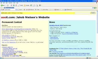
Useit.com – Jakob Nielson’s Website

But, it’s also good to remember that Nielson is a visionary, that he has over twenty years’ experience in technological usability, and that he is often misinterpreted or misunderstood. So, while many designers scoff at Nielson’s self-assigned “guru” status, his latest book, “Prioritising Web Usability,” may be the one book you should own for usability guidelines, even if you prefer to design with multimedia.

It appears that Nielson has “gone soft” on multimedia such as Flash, as he states that isn’t as “bad” as he declared it to be in 1995. It appears that technology, developer, and designer awareness about usability has increased, thereby creating a more usable environment for multimedia for users. However, my experience shows that while many multimedia developers and designers often notice usability standards, accessibility guidelines are ignored when multimedia is applied to Web development. This problem is exacerbated when code is available for a “cut and paste” methodology, especially for video content.

Read More

Creating a banner ad manager

Creating a banner ad manager

Many web sites include banners that display advertisements. Often these are static JPEG or GIF images but sometimes, the banner rotates through a series of images, with a transition between each. In this tutorial, I’m going to show you how to use Flash to create a dynamic banner ad manager. You’ll be able to load external images and display them one at a time, with a fade in transition effect.

The Flash movie that we build will load external JPEG, GIF, PNG or even SWF files into the banner. You’ll be able to manage the settings from an XML file that contains the list of images as well as the timings for the fade effect. You can determine the length of the fade in or out as well as the length of time that each image displays.

I’ll cover the following areas in the tutorial:

  • Loading an external XML document
  • Creating a class file in AS2.0
  • Working with the Transition Manager class
  • Working with Set Interval

I’ve used ActionScript 2.0 with a single class file in this tutorial so you’ll need at least Flash MX 2004 to complete the example. I’ve assumed that you’re familiar with writing ActionScript and that you understand concepts like variables and loops. I’ve also assumed that you’ve got a basic understanding of the XML object. If not, you might want to refresh your knowledge with some of the earlier tutorials.

You can download the source files for the tutorial from the blue Properties box that contains the article PDF. There's a heading titled Code Download and you can click the Details link next to it to get the zip file. The download includes the starter files you'll need as well as the completed files.

Note: If you have difficulties downloading the source files or PDF, you might have a problem with your cookies. Delete the cookies from your machine and try again. In Internet Explorer, you can do this by choosing Tools > Internet Options… and clicking the Delete Cookies… button on the General tab.

Read More

Working With Mobile ASP.NET Apps – Part 2

In part 1 of this tutorial we reviewed some basic concepts behind mobile development, we created a new mobile web application project and linked to a sample database and reviewed some of the principals behind mobile web forms.

In this second and final part of the series we’ll continue building upon our sample application and put an ObjectList control into practice using our sample data source.

We’ll also look at some of the mysteries behind this control that should help you avoid a lot of R&D and trial and error programming when it comes to rendering tabular data for mobile devices.

Note: Visual Studio .NET running ASP.NET 1.1 is required for this tutorial. Both VB.NET and C# code samples will be provided

ObjectList Confusion

In part 1 we reviewed the properties list of the ObjectList control and found that there were a plethora of properties available to use, yet finding complete documentation on the items is sometimes difficult. Even with the MSDN library itself the examples and explanations sometimes provide little or no help.

To compound the problem, online support and newsgroup discussions on the subject are somewhat scarce. It seems that mobile development is a bit of a hidden art, and you often have no choice but to simply figure things out on your own.

In this section we’ll cover some of the peculiarities of the ObjectList control that should help you avoid a lot of the common exceptions and errors encountered.

Read More

Working With Mobile ASP.NET Apps – Part 1

In the world of ASP.NET there’s a whole other breed of application that few developers ever have the need to work with: Mobile Web Applications. These are applications that are designed to run on mobile devices which can be anything from a pocket PC, to a BlackBerry, to a cell phone.

This realm of development is a very confusing one, due to the volume of disparate devices and their methods of implementation and visual capabilities. Often developers are left to focus on one particular style of device in order to bring out the best capabilities instead of taking a more generic one-size-fits-all implementation.

Because mobile development is so radically different in presentation the .NET framework has a dedicated set of assemblies for it residing in the System.Web.Mobile namespace. In this namespace is a dedicated set of interface components designed specifically to run on mobile devices, most of which duplicate the common components in regular web forms development such as labels, buttons, textboxes and so forth.

Although these components are fundamentally similar some of the principles behind mobile development are hidden and convoluted and developers are left spending many hours of trial and error getting certain basic features to work.

The goal of this two part tutorial is to review some of the not so obvious aspects of mobile development that often leave developers scratching theirs when finding solutions. We’ll implement a basic demonstration application that will take some of the common features performed in regular web development and see how they are implemented in a mobile development environment.

In part one we’ll setup a new mobile web application and connect it to a sample database so we have some data to work with and we’ll also review the DataGrid’s cousin in mobile development: The object list control. We’ll review some theory behind this control and some of its more confusing implementation designs and how best to use it and how not to use it.

In part two we’ll continue building on our demonstration application and implement a mobile form which uses the object list control and sub forms, and see how DataGrid style pages are developed in a mobile environment.

Note: Visual Studio .NET running ASP.NET 1.1 is required for this tutorial. We’ll also use the Northwind sample database which comes with SQL server as our test data source, or you may use any database of your choice for the purpose of demonstration

Read More

Design and Accessibility: Part XVI

Content, Usability, and Angry Clients

In the previous article, Linda discussed several points contained in current accessibility policies and showed how to build one for your sites through various online examples. In this article, Linda becomes the angry client, as her personal information was included in the U.S. Veterans Administration databases stolen from a private home in May 2006. In an effort to turn a personal trial into a lesson on content development and usability, Linda shows how emotion colours how viewers read site content. She demonstrates how to avoid confusion and – alternately – how to win customer confidence through readable and, therefore, usable Web text.

Read More
Newer articles Older articles