 This chapter introduces you to the concept of making wireframes of web site projects, and how to create them. The rest of this chapter looks at creating UI specs and prototypes. These three topics are important when designing a professional web site to allow you to keep the client and the rest of your team clear about how the design is progressing, and to be able to communicate requested changes.
This sample is taken from Chapter 3: "Wireframes" of the Glasshaus title "Usable Shopping Carts"


When creating a usable UI for the Web, one of the most important things to
do is to make sure you have the interface planned well before you start building.
The most common and the most reliable way to plan an interface is to create
what is referred to as Wireframes.
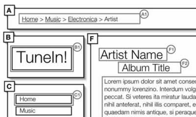
Wireframes are similar to blueprints - we need one to represent each of the
individual screens of the overall UI. They are usually covered in colourless
squares and have little notes all over them. As boring as they sound, they are
perhaps the most important step in ironing out the product before you set the
backend or middleware development in motion. A typical Wireframe looks something
like this:
Wireframing can save weeks of time in development because of the number of
errors that are avoided - you can make sure everything works at this stage,
and get the client's approval, before you get to the coding stage. You can save
a ton of money because of this, and the client is kept happy because they can
see how things will look in the finished product. So, if you are serious about
making a usable product, do what you can to get some Wireframes of your product
assembled.
In order to make a good set of Wireframes you need to start
off with some of the information you collected while determining the Information
Architecture. For instance, having another look at the Rapid Prototypes from
Chapter 2
will help quite a bit in gaining an understanding of the page elements that
you might want to use. You will also want to use the Site Map and Task Flows
to get an idea of the number of screens, dialog boxes and alerts you will
need to wireframe.
When you start to think about which screens
you will be working with it is important to consider every dialog box, alert
and error page as well. This is one of the only times that anyone ever considers
how these screens are put together, or even what content is on them, so
it is very important to include as many of these details as possible. We've
all seen many error messages that don't make any sense and plenty of dialog
boxes that are useless or poorly designed. This is your chance to get it
right for a change! Make sure you document as many as possible.
When you have an idea of how many screens you will need
to make, you should start designing some reusable screen elements. If you
don't feel up to creating your own, or you are looking for inspiration, there
are a number of software packages available that contain a basic library of
screen elements. We'll talk more about this and the basics of creating Wireframes
below, but first let's get into the details of how we developed the Wireframes
for the Shopping Cart product, TuneIn!
Wireframes in UI
Wireframes typically show the main parts of the screen sectioned
off into modules that reflect certain functions (sometimes known as modular design).
If you look at the layout of any product you will notice that different areas
of the screen have been designated for certain functions. It is important
to understand this before the developers start to program as they rely on
the grouping of certain elements to code efficiently.
If you provide logical groups of items before the pages
get set into code it will speed up the development process and aid in your
communication with developers. This modular design approach can also aid in
translating the product onto different platforms, such as PDAs or TV, as it
allows for related components to be clustered together into autonomous groupings.
It will also make the design much easier to understand and therefore automatically
improve usability.
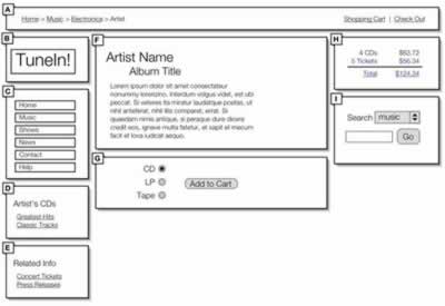
The screen above is a Wireframe designed by combining features
from the Paper Prototypes in Chapter
2, and discussing the design with team members
and external testers. As you can see, it has been sectioned off into several
areas. Typically, as you can see from the Wireframe above, a screen on the
web is separated into areas such as navigation, sub navigation, branding,
content, related
content and copyright. These groups will change from product to product, so
make sure to define the groupings for your product appropriately. You can
just scribble these groupings onto a piece of paper or the whiteboard for
now, as we will be looking at the proper creation of Wireframes a little later
on.
It is important to note that the location and size of the
groupings should maintain a certain degree of consistency across the different
screens of the product. If some screens need to have different groupings there
should, if possible, be a secondary template that applies to all of these
additional screens – we really don't want to have more than 2 or 3 different
screen layouts. Consistency will make your product much more intuitive and
this technique of grouping elements is a very simple but effective way to
ensure consistency.
When you have your groupings drawn out you should begin
to look at labelling the individual elements themselves, as seen below. There
are a variety of ways to label elements: some people prefer to put text labels
where the actual page elements will be, and other people prefer to associate
the labels with numbers or letters. Whichever way you choose, the important
thing is to label every single element that has a function, including buttons,
form fields, branding, the titles for content, and even the location of the
content itself.
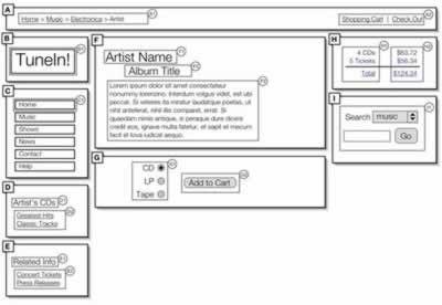
These diagrams that are usually presented with notes describing the interaction
involved with each of the elements. These can be set up on a separate page,
in a reference key, or as a series of explanations on the sides of the paper
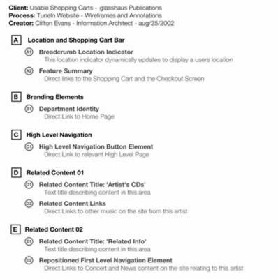
that have lines pointing to the elements. The level of detail that is needed
in these annotations depends on your audience, and on how complicated the interactions
are. For an example we've included an image below that shows a simple set of
annotations that are associated with the Wireframe above. Please feel free to
make your Wireframe references more detailed than this:
After you have determined how to group the elements, the labelling method you
should use and how you would like to document the annotations, you can move
onto creating the actual Wireframes. But before we begin to explain what programs
are available, let's go into a small aside about an additional Wireframing method
to think about in the future - we want to make sure you are aware of all the
possibilities before you start.


 This chapter introduces you to the concept of making wireframes of web site projects, and how to create them. The rest of this chapter looks at creating UI specs and prototypes. These three topics are important when designing a professional web site to allow you to keep the client and the rest of your team clear about how the design is progressing, and to be able to communicate requested changes.


 George Petrov is a renowned software writer and developer whose extensive skills brought numerous extensions, articles and knowledge to the DMXzone- the online community for professional Adobe Dreamweaver users. The most popular for its over high-quality Dreamweaver extensions and templates.
Comments
Be the first to write a comment
You must me logged in to write a comment.