In this article you'll find detail information about the options, included in DMXzone App Connect. We covered everything from dynamic attributes to static events and you can explore what they do. If you want to know how the extension works, make sure to check out the user manual, because it's packed with useful video tutorials.
DMXzone App Connect Data Traversal Manual
DMXzone App Connect Reference
Features
Dynamic Attributes: Inputs
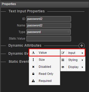
You can add dynamic attributes to your form inputs. Keep in mind that the app connect panel only shows the available attributes for the selected element.
Value
You can change the attributes of the input by selecting one of the available attributes. With this dynamic attribute, you can change the value of the input.
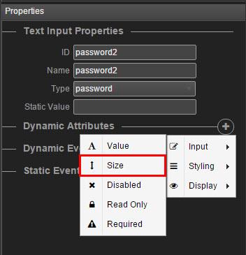
Size
Changes the size of an attribute and specifies the visible width, in characters, of an input element.
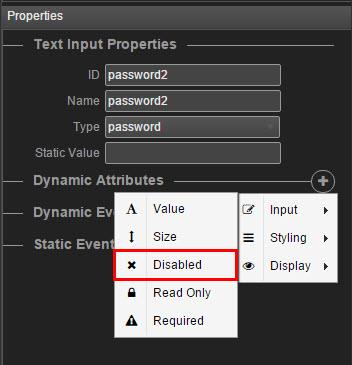
Disabled
When applied, it specifies that the element should be disabled. A disabled input element is unusable and un-clickable.
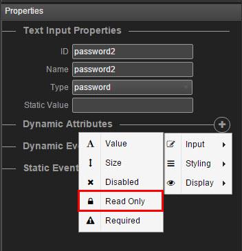
Read only
When applied, it specifies that an input field is read-only. A read-only input field cannot be modified. However, a user can tab to it, highlight it, and copy the text from it. The readonly attribute can be set to keep a user from changing the value until some other conditions have been met (like selecting a checkbox, etc.)
Required
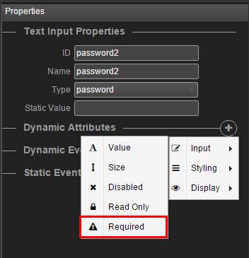
When applied, the dynamic attribute specifies that an input field must be filled out before submitting the form.
Dynamic Attributes: Div
Repeaters
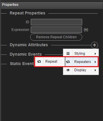
Along with the styling and the different display attributes, you can add a repeat repeat attribute to your divs.
Dynamic Attributes: Images
Image source
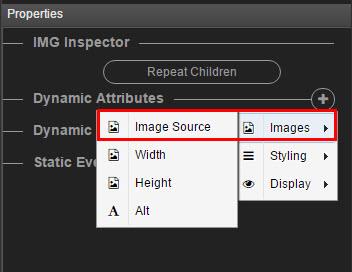
When applied, the image source attribute specifies the URL of the image.
Width
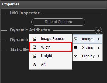
When applied, the width attribute specifies the width of an image, in pixels.
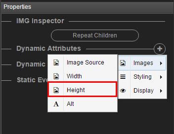
Height
When applied, the width attribute specifies the height of an image, in pixels.
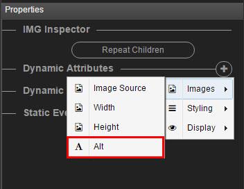
Alt
When applied, the alt attribute specifies an alternate text for an image, if the image cannot be displayed. It provides alternative information for an image if a user for some reason cannot view it (because of slow connection, an error in the src attribute, or if the user uses a screen reader).
Dynamic Attributes: Form
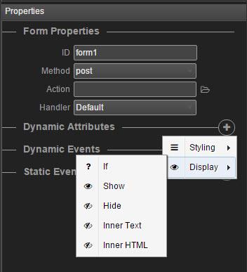
Styling and Display
You can apply styling and display attributes to your forms.
Dynamic Attributes: Styling
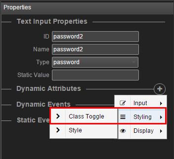
Class toggle
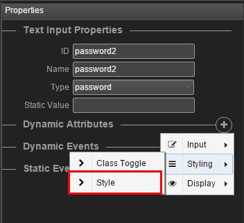
From the styling attribute, you can select class toggle if you wish to change the class of the element.
Style
When applied, the style attribute specifies an inline style for an element and will override any style set globally.
Dynamic Attributes: Display
Show
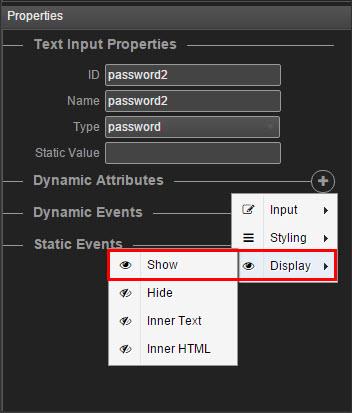
When applied, the display show attribute hides the element until a certain condition is met. The difference between show and display if is that display if is not even rendered on the page.
Hide
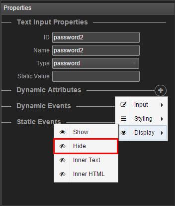
When applied, the display hide attribute hides the element until a certain condition is met.
Inner text
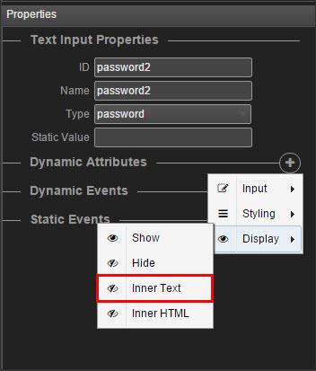
When applied, this dynamic attribute retrieves and sets the content of the element as plain text.
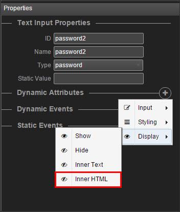
Inner HTML
When applied, this dynamic attribute retrieves and sets the content of the element in HTML format.
Dynamic Events
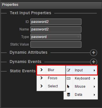
Blur
The blur dynamic event is most often used with form validation code (e.g. when the user leaves a form field). It occurs when an object loses focus.
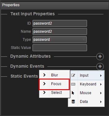
Focus
When applied, the focus event occurs when an element gets focus.
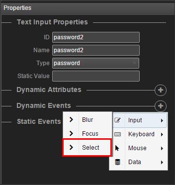
Select
When applied, the select event occurs after when some text has been selected in an element.
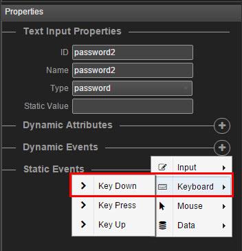
Key down
When applied, the event occurs when the user is pressing a key (on the keyboard).
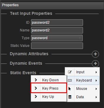
Key press
When applied, the event occurs when the user presses a key (on the keyboard).
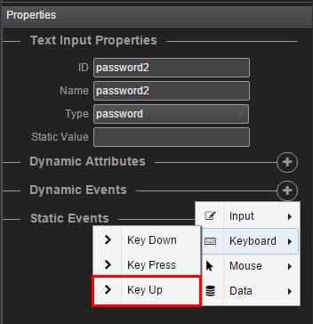
Key up
When applied, the event occurs when the user releases a key (on the keyboard).
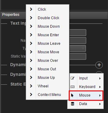
Mouse events
There are a large number of mouse events, which you can applied and occur on different mouse actions. You can choose between: click, double click, mouse down, mouse enter, mouse leave, mouse move, mouse over, mouse out, mouse up, wheel and context menu.
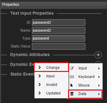
Change
When applied, the change event occurs when the content of a form element, the selection, or the checked state have changed.
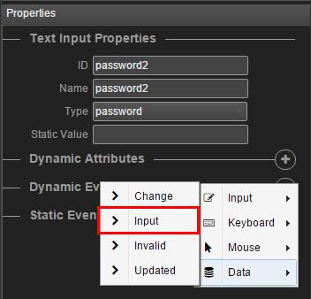
Input
When applied, the event occurs when an element gets user input.
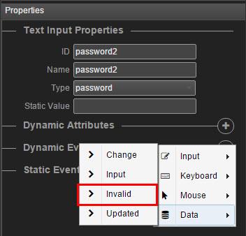
Invalid
When applied, the event occurs when an element is invalid.
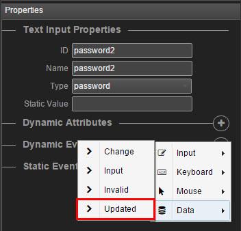
Updated
When applied, the event occurs when an element is updated.
Key and Event Modifiers
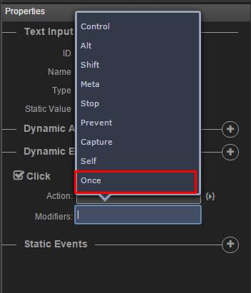
You can use the following modifiers to trigger mouse or keyboard event listeners.
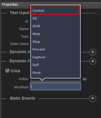
Control
When applied, the alt modifier requires that the ctrl keyboard key is pressed to trigger the event.
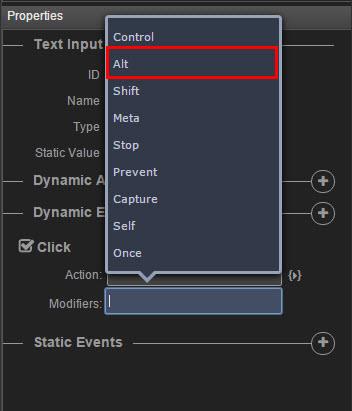
Alt
When applied, the alt modifier requires that the alt keyboard key is pressed to trigger the event.
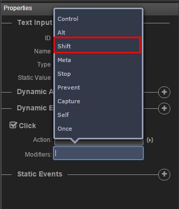
Shift
When applied, the alt modifier requires that the shift keyboard key is pressed to trigger the event.
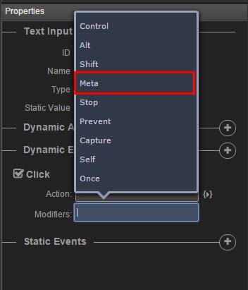
Meta
On Macintosh keyboards, meta is the command key (⌘). On Windows keyboards, meta is the windows key (⊞). On Sun Microsystems keyboards, meta is marked as a solid diamond (◆). On certain keyboards, specifically MIT and Lisp machine keyboards and successors, such as the Knight keyboard, space-cadet keyboard, meta is labeled “META”. On Symbolics keyboards, meta is labeled “META” or “Meta”.
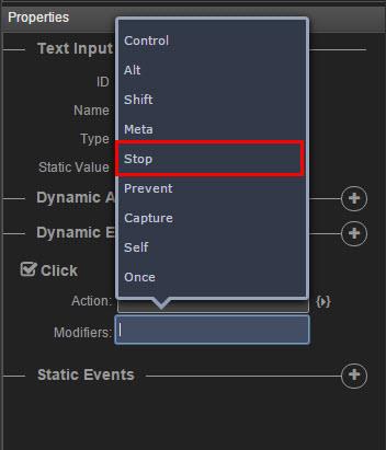
Stop
When applied, the stop modifier stops the triggering of the event and prevents further propagation of an event during event flow.
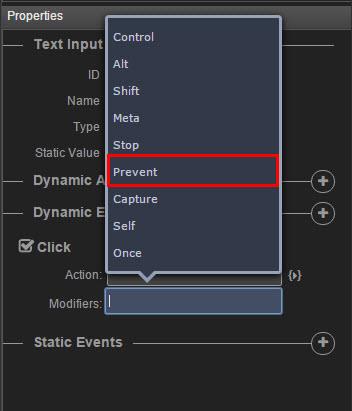
Prevent
When applied, the modifier prevents the chosen event to be executed. It cancels the event if it is cancelable, meaning that the default action that belongs to the event will not occur.
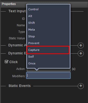
Capture
Capture mode is used for event handling.
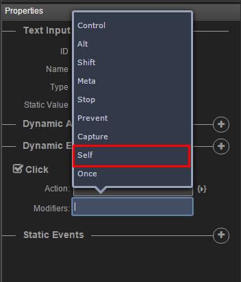
Self
Only trigger if the target of the event is itself.
Once
When applied, this modifier triggers the event at most once.
