2. Break up the ordering process into bite size chunks
The ordering process can often be quite complex. Users must typically enter a delivery address, choose their delivery method, enter their payment methods and then finally confirm their order. Trying to do all this at once can cause problems because users need to enter so much information.
Breaking the process up into smaller chunks allows users to tackle each step at a time. There's less to think about at each step and less information to enter. For example, Amazon breaks the ordering process up into the following steps:
- Login
- Choose delivery address
- Choose delivery options
- Enter payment details
- Review and submit the order
3. Tell users where they are and where they're going
Isn't it awful when you're on a journey and you don't know how far you've been, or how far you still have to go. Well it can be just as frustrating for users when they're trying to buy something online and they don't know how many more steps are required before finally making the purchase. This is why it's important to let users know where they are in the ordering process, and how far they have to go. For example, Dixons shows the current ordering step, and the steps still to go:

Alternatively, you could just specify the step number, together with the total number of steps left in the ordering process. For example, "Enter delivery address (step 1 of 4)".
4. Don't make the ordering process harder than it needs to be
It's amazing just how many ecommerce websites make the ordering process harder than it really needs to be. For example, users are asked to enter their credit or debit card expiry date as a month (Jan, Feb, March etc.), instead of a number (01, 02, 03 etc.). This forces them to convert the number shown on the credit or debit card to the corresponding month, instead of just entering the number straight in.
At each step of the ordering process think about how this step could be simplified. For example, do all of the input fields really need to be captured? By simplifying and streamlining the ordering process you should be able to minimise the number of problems users might experience along the way.
5. Address common user queries
It's important that throughout the ordering process, common user questions and queries are addressed. For example, users might want to know how long delivery is likely to take, or if they have to enter extra information such as their date of birth, they might want to know why this is.
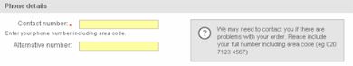
Go through the ordering process and ask yourself at each stage: What queries might a user have? Answers to these queries should either be provided on-screen, or through a hyperlink. For example, Marks & Spencers explain why they need users to enter a contact telephone number:
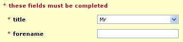
6. Highlight required fields
There's nothing more annoying than filling out a form, only to have it returned because required information is missing. It should be made very clear from the offset exactly which fields need to be filled in and which are optional. This can be done by simply marking those fields that need to be filled in, usually with a "*". dabs.com does this quite well:
7. Make the ordering process flexible
By making the ordering process flexible, users should not only feel more in control, but should also be less likely to come across critical problems. For example, some ecommerce websites force users to undertake a postcode look up when entering an address. This can cause problems for those users with unconventional or new postal addresses because no list is returned for their postcode, or their particular address is not present in the list. This means that they simply can't enter their address and therefore can't place their order (this has happened to myself a few times).
A good example of an ecommerce website that has built flexibility into their ordering process is CD WOW!. They allow users to place orders without having to register with the website, meaning that those users who are not comfortable registering can still place orders:
8. Put users' minds at ease
Many consumers are still not 100% comfortable buying online. They might be concerned about giving out their credit card number, or about not receiving the items they've paid for. It's therefore important that you allay these concerns and put users' minds at ease.
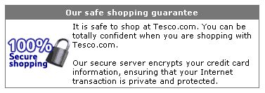
Try and think about the concerns users might have at each step of the ordering process, and try to address them. For example, Tesco make a note at the payment stage of their ordering process of explaining to users that it's totally safe to shop at Tesco.com:
9. Have users confirm their order before buying then provide confirmation
The last stage of the ordering process should always ask the user to confirm their order. Users should be able to see a summary of their order, including how much it will cost and where it will be delivered to. They should then either be able to cancel or place the order. It's probably best not to copy something like Amazon's "1-click" ordering system, because this allows orders to be placed without checking and confirming important details, such as the delivery address and delivery costs.
Confirmation should be provided for orders placed, so that users know whether their order was successful or not. This should include information such as:
- The expected delivery date
- The order number
- How to track the order online (if this is possible)
10. Send a confirmation e-mail
Once a user has placed their order, a confirmation e-mail should be sent out straightaway. According to Jakob Nielsen's Alertbox, December 8, 2003Confirmation e-mails should:
- Be brief
- Tell users what they are likely to want to know, such as the order number
- Should be a real customer service ambassador for the company
Remember, it's much cheaper for someone to resolve an issue online rather than having to call customer services. By second guessing users' queries, such as outlining how long a delivery is likely to take, calls to customer services can be minimised.
Conclusion
This article has outlined ten ways to improve the usability of your ecommerce site. Following these guidelines should not only make your ecommerce website more usable, but ultimately more successful as well. Of course, you can only go so far with usability guidelines, which is why usability testing should be an important part of every ecommerce project. Follow usability guidelines and carry out usability testing with real users and you should find that your ecommerce website is not only usable, but very effective as well.
This article was written by Neil Turner, a usability consultant at Webcredible. He's extremely good at usability consulting and knows an awful lot about the usability testing.